


- Conocimiento,
- Poder,
- Integridad,
- Gravedad
-
- Felicidad
- Suerte
- Bienestar
- Prosperidad
- Éxito
Los cambios son necesarios


Producto
Everything

This year, we got tickets to visit one of the most renowned trade fairs in our city: The Mobile World Congress or as we call it here "The Mobail".

Since 2012 we have been committed to optimising our business with China, and from there we decided to share our know-how to expand our services and support.
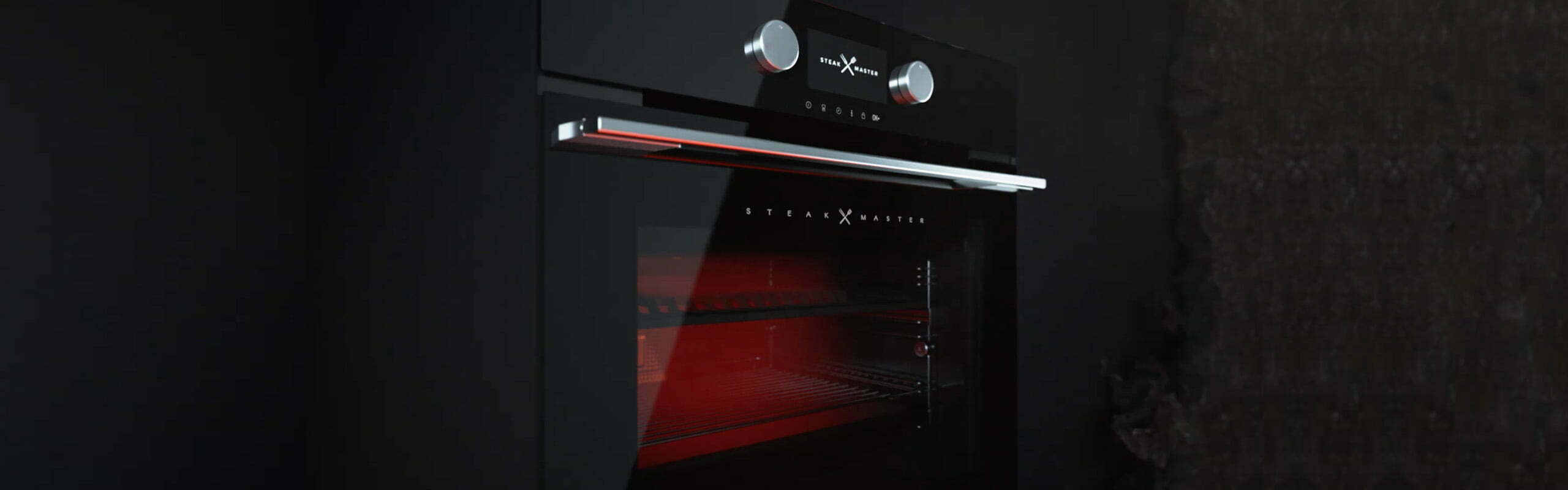
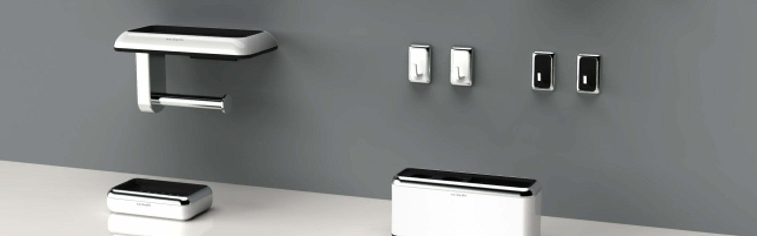
The development of the Steak Master oven was a multidisciplinary challenge in which we worked together with the Teka Group team.
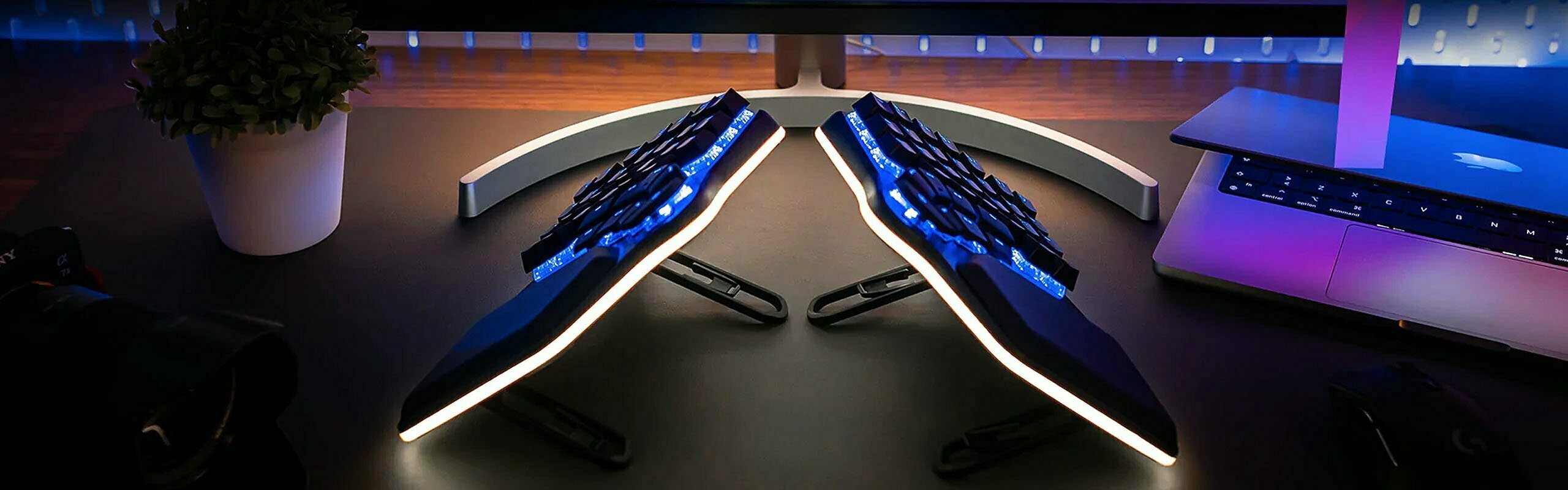
Create. Coding. Play. Repeat. A split ergonomic keyboard is not the only thing that makes this keyboard more comfortable...
By adapting the working methods, the adaptation with the customer and his satisfaction is achieved in order to continue with new products.
We have always found the collaboration in design between East and West in a global world very interesting.

It is always a great satisfaction when a project in which the whole team has put a lot of enthusiasm reaches the market. It is satisfying when a project starts.

Being a "Workplaner" means being part of an effective team! People identify with specific groups that are perceived to be very different.
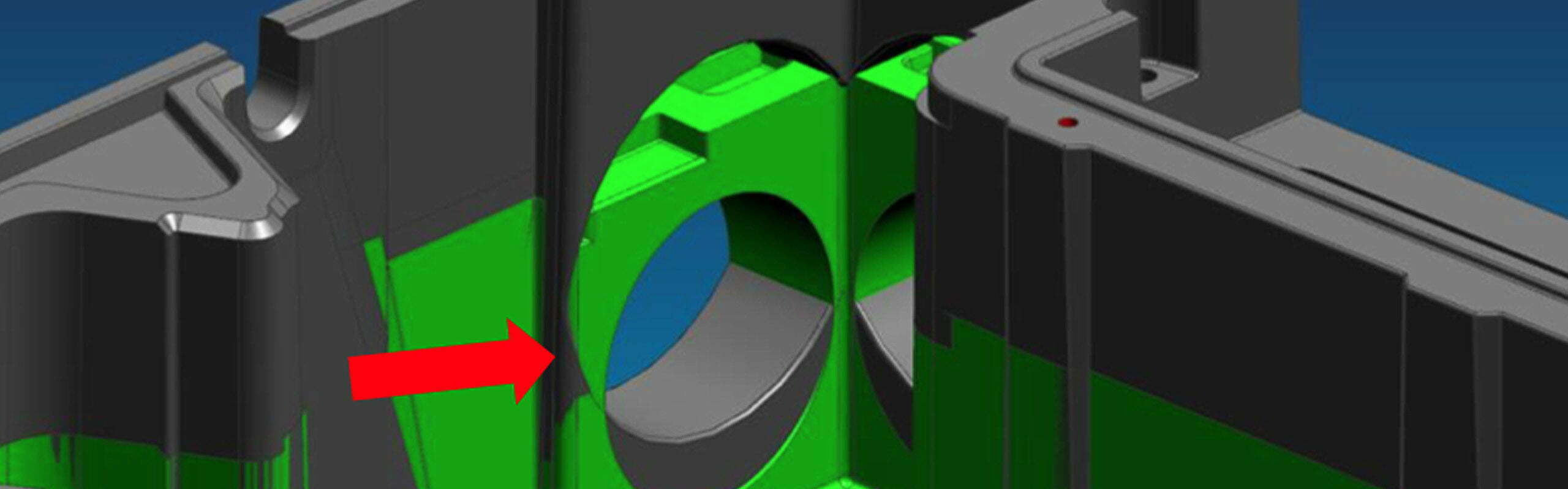
We specialize in making the product achievable, from conceptualization to manufacturing. Projects, engineering and mechanics.

Companies are also a reflection of this reality. Our corporate image has matured over the years, although the essence has always been maintained.

This year, we got tickets to visit one of the most renowned trade fairs in our city: The Mobile World Congress or as we call it here "The Mobail".

Take advantage of PET bottles for your 3D printer. We all agree that the recycling of plastics entails a considerable logistical effort.

Manta 5 electric water bike SL3. Designed in Waikato, New Zealand, it promises an exciting new era in water sports.